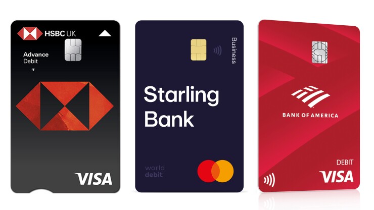
Before launching vertical credit and debit cards in August 2021, HSBC U.K. worked with British charities to make its new designs accessible for people with dementia, visual impairments, learning difficulties, dyslexia and color blindness.
Fintech issuers like Venmo and Neo Financial had already been drawn to vertical cards for the novelty and as a way to differentiate themselves from incumbent banks’ horizontal cards. But for HSBC U.K. and other mainstream banks, accessibility was the key consideration for choosing this design.
Issuing cards with a portrait orientation aligns with the way in which consumers hold their cards when they tap or dip them at point-of-sale terminals, making card payments more intuitive.
“Older customers, people with cognitive impairments, or those who get easily confused at checkouts find our vertical design easier to navigate as it makes it obvious which way round their card should be,” said Stephanie Feakes, HSBC U.K.’s customer experience manager.
Horizontal cards are a legacy of outdated payments technology, bankers say.
“The reason why payment cards are horizontal and have embossed numbers on the front goes back to when retailers used card imprinters to make a carbon copy of the front of the card,” said Mark Day, art director at the U.K. digital challenger

Orienting cards to the way that people pay in stores was also a key consideration for South Africa’s Absa Retail and Business Bank, which launched vertical credit and debit cards in 2019, said Cowyk Fox, Absa’s managing executive for everyday banking.
“I’m seeing a trend developing towards portrait orientations on cards, aided by the growth of tap-to-pay,” said Brian Riley, Mercator Advisory Group’s director of credit advisory.
HSBC U.K.’s vertical cards include an arrow at the top and a carved-out notch at the bottom to indicate which way the card should be inserted into card readers and ATMs, tactile raised dots to differentiate credit cards from debit cards, flat printed card numbers, contrasting colors and a larger font to ensure card details are legible.
Mastercard similarly introduced its
At HSBC, “the vertical orientation allowed us to simplify the background and increase the HSBC logo size without losing proportion,” said Feakes. “A key focus was for the HSBC hexagon to stand out, which makes our cards more recognizable to people reliant on logos for identifying brands, for example customers with dyslexia, dementia or learning difficulties.”
Moving the HSBC U.K. card details to the back further simplified the front design, while allowing for bigger and bolder text on the back.
HSBC U.K.’s design took into consideration how its cards would be used online.
“People with dexterity restrictions can find it difficult to turn their cards over mid-transaction to read the [card verification value] number, so having all the details on the back in one place makes online payments easier,” said Feakes. “When using your card in store, you don’t need your card details.”
The removal of embossing also ensures that information such as telephone numbers aren't obscured. “We had previous reports of customers not being able to read our telephone banking number because the embossing on the front of the card ran straight through the numbers,” said Feakes.
Bank of America also puts all cardholder information on the back of the contactless vertical debit cards it launched in November 2020. The bank is gradually converting its 39 million debit card accounts to the vertical card format.
“The cardholder information is laser-printed on a white background, not embossed,” said Robin Growley, BofA’s head of consumer debit cards and payment products. “So it’s easier for visually challenged people to see the writing on the back of the card. We had customer feedback that the chipping on embossing can wear off, making it hard to read embossed numbers.”
BofA introduced a contactless feature as part of its launch of vertical debit cards, reasoning that the new orientation was a more natural way to hold the card for contactless payments, Growley said.
Putting card details on the back improves cardholders’ security by making it less easy to capture personal information when cards are being used in stores or at ATMs, Day said. Although Starling is a digital-only bank that requires its customers to download its mobile app, physical card transactions are still important for its 2.7 million customers. According to Day, 41% of all Starling debit card payments are physical transactions.
For digital-first fintechs such as the U.S. business cash management provider Rho, PayPal’s Venmo, and Canadian neobank Neo Financial, issuing vertical cards helps them stand out from incumbent banks. According to Riley, card design generates consumer interest.
“Our corporate credit cards are the only tangible physical products we provide for our clients,” said Alex Wheldon, Rho’s president and chief product officer. “It’s important for us to show them that we’re different from other financial services providers.”
Rho designed its cards for maximum brand exposure during contactless and chip card reader payments.
“Our logo is placed at the bottom, which enables other people to see it during payment,” said Wheldon.
For Venmo, issuing vertical credit and debit cards reflected the Venmo app’s vertical orientation, said spokesperson Jaymie Sinlao.
“Our research found that customers cared about the look and feel of their Venmo card, and wanted something that was distinctive and different from traditional cards,” she added.


