-
Capital One is employing a technology called responsive design that changes the appearance of its website for desktop, smartphone and tablet devices.
May 20 -
A complete site makeover has brought the Buffalo bank more online account openings and higher customer satisfaction among online banking users.
March 20


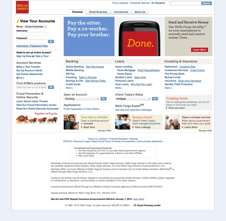
Wells Fargo & Co. (WFC) revealed Monday sweeping changes to its website, which the fourth-largest bank by assets spent about two years creating based on customer feedback. In redesigning WellsFargo.com, the San Francisco bank aimed to ensure the site's navigation experience is just as easy to tap as click. The makeover includes more white space, fewer link farms and added imagery.
This initiative follows a
"We made sure the site worked well for the tablet experience as well as desktops," Shannon Lundgren, vice president for product management of digital sales and service, tells BTN. "We are taking away potential clutter and providing a lot more white space and simplicity."
More than 60 million monthly online visitors come to WellsFargo.com. The bank, which offers an iPad app, does not publicly report its traffic numbers by device type.
Today, almost one in 10 consumers bank on tablets industry wide, according to data published in January by Javelin Strategy & Research. Meanwhile, one in four tablet users worldwide is expected to pay bills via tablets by 2017, according to a
Beyond a crisper design, the new WellsFargo.com includes more financial-related content that translates bank talk into English, an approach
The content is meant to mirror the consultative service approach from the bank's 6,200 stores and help customers find articles and products suited to their financial goals. To that end, among the most visible changes to the new site is a section on the homepage known as the "needs-based area," a running carousel meant to serve as a resource hub for people's pivotal life events [such as retirement and going to college].
Each need area contains one-click/touch access to relevant educational content and products to consider. Say a consumer is getting ready to attend college for the first time, illustrates Lundgren. Potentially, he could benefit from seeking out advice about how to create a budget as well as find out what financial aid options are available in the dedicated section on the bank's website. The area also links to an existing student community that allows people to ask "how do I" type questions of the group. New articles were written for the needs-based areas. Existing financial education content called
The site's redo also includes a more colorful About Wells Fargo page that allows visitors to hover over graphically rich tabs like "blogs and social media" to see what's inside of the link before clicking or tapping on it. Contact numbers were given more prominent space in the new design, while the login continues to get hard-to-ignore real estate on the top left corner of the website.
When asked about the business metrics expected of the site's overhaul, Lundgren says, "Our vision is to help customers succeed financially." The broad idea, she says, is to satisfy customers' digital wants in a move to retain them longer. "We are building for life-long relationships," she says. "That's what success looks like for us." Specific metrics weren't divulged.
What drove the bank to initially overhaul its website was its sunsetting content management system (CMS). When the undisclosed vendor announced the technology's end of life, Wells Fargo had to make a change and decided to enhance its entire website experience while doing so. The bank says the new CMS will let Wells Fargo develop, author, deploy, maintain and re-use content types across more device types.
Lundgren says customer research played a crucial role in guiding the bank on its new look. "Part of our core values are to stay targeted and focused on the customer," she says.
That means listening to customers and incorporating their feedback into the design. In an earlier iteration of the redesign, the bank offered customers two homepages, one of which was tailored to the person logging into the site - but that didn't take among testers. "We found out customers didn't need another homepage," she says. "They didn't want to click even for a visually rich experience. We nixed it."
To continue to elicit customer feedback, the site allows visitors to submit comments about the content while they are navigating WellsFargo.com. Future feedback will influence future designs. "It's important to listen," she says.
Looking ahead, the bank plans to roll out more chat interfaces on the website and improve the mobile site experience.


