-
Like a mother who hides her child's vitamins in the cereal, USAA Federal Savings Bank is disguising new technology through old-fashioned, face-to-face service.
November 11

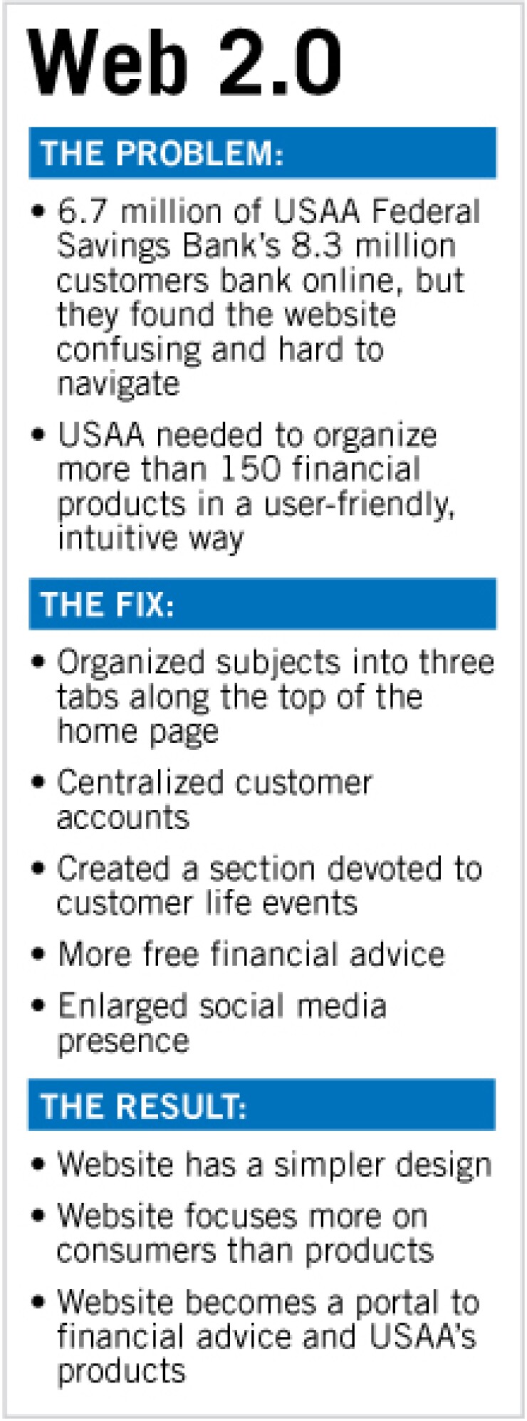
USAA Federal Savings Bank plans to unveil an overhauled website this month that can provide the kinds of conversations online that typically only happen face-to-face in branches.
The San Antonio, Texas, company has already proven its savvy at serving its remote audience by being among the first to offer features such as remote check deposit from computers and mobile phones. Its redesigned website, 18 months in the making, furthers the bank's ability to serve its customers without relying on branches.
The site showcases a page devoted to the changing life events of its customers. Though banks have explored this concept before, customers have had to go to nonbank sites to evaluate their financial decisions in this manner.
"Customer experience is something the banks and credit unions have been talking about for a couple of years," said Jacob Jegher, a senior analyst at the research firm Celent. "But when push comes to shove, we have not seen much emphasis with full redesigns."
Most banks have been content to leave their websites in the condition they were in back in the 1990s, organized by product line and transaction type, experts say.
Competitors in the personal financial management space have taken a different approach, encouraging customers to make financial decisions based on life events, providing articles and forums that customers have found more helpful than they would the details of a digitized brochure.
At USAA, "we were like a large big-box store," Rhonda Crawford, the bank's vice president of digital strategy and operations, said. "We want to feel more like a small boutique. That is what inspired the redesign."
The new site's Your Life Events tab has sections about retirement, family life, disaster and recovery, homes and cars, as well as personal finance and work life. The idea is to offer advice that can ultimately lead to product sales.
"Rather than looking for an annuity, you can look at Your Life Events, under retirement," Crawford said.
This strategy extends beyond the layout of the website. USAA will encourage members to call, email and use online chat to get free advice from certified financial planners and other experts.
Of USAA's 8.3 million members, 6.7 million are registered online banking users. Most never visit its lone branch. Military members are also deployed far and wide, and they often need to bank at non-standard hours. The needs of their families are also different, because they must sometimes manage budgets for two different households if they are separated.
USAA had a further challenge in organizing its 150 products that span banking, insurance, mortgages, and investment products.
Experts said USAA's strategy was an intelligent way to keep customers coming to the site, as there is a large need for information about finances.
"People are getting this advice and information online, and they will go to wherever they find it," said Nicole Sturgill, a research director at TowerGroup in Needham, Mass.
Customers can now go to USAA with questions, she said, and expect to find answers there.
"From a site design perspective, many financial institutions are rethinking the order, asking customers what they want to do first," Ron Shevlin, a senior analyst at Aite Group LLC of Boston, said.
Bank of America Corp., of Charlotte, N.C., also extensively redesigned its website in the second half of 2010 to jettison unnecessary tabs and to simplify navigation for its 29 million online banking customers.
Jamie Armistead, the senior vice president and director of user experience for digital channels for Bank of America, said the bank wanted to make the site more customer-focused and easier to use.
"Common complaints were that [the website] was cluttered and [it was] difficult to find things," Armistead said.
Bank of America also wanted to make the site a place to offer financial education.
"We try to feature more content that is helpful for people," Armistead said, and that can include articles on borrowing basics, as well as how to use credit effectively, among other things.
Customer expectations for websites have also changed. Many sites use Flash to create dynamic graphics that change appearance when a visitor's mouse hovers over them. Consumers expect that level of sophistication from their banks as well.
"I hear from our banking clients all the time that their customers want to know why, when they log onto the online banking site it hits them like a ton of bricks," Jegher said. "They are so used to rich, interactive experiences online, but the bank does not seem to change."
Experts said that next step for USAA, after the Your Life Events tab, would be to make recommendations based on what USAA knows about its customers.
"USAA needs to take this to the next level and proactively evaluate what customers have," said Stessa Cohen, research director of banking industry advisory services at Gartner Inc. in Stamford, Conn.
About 40% of online banking customers want their accounts, credit card interest rates and other services evaluated automatically to receive recommendations for alternative products when they are online, she said.
USAA said it might consider such additions over time.


