When Huntington Bank launched its digital budgeting suite The Hub early this year, it knew that no matter how great it thought it was, some customers just wouldn't be interested. As a result, it gave customers the ability to hide the feature.
“Some people said, ‘I don’t want it,’ ” said Andy Harmening, the $108 billion-asset bank’s consumer and business bank director. “As much as we’re excited about The Hub and make it easy to use, some people will look at it and say, 'Take the whole thing away from me.' "
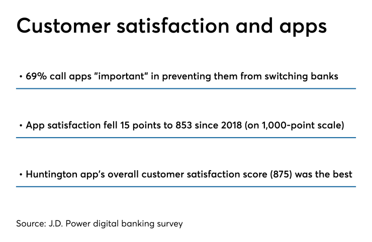
The experience illustrates a growing problem with banking and financial apps — many are growing too complicated with too many features available. A recent J.D. Power study found consumers were overwhelmed by options in mobile banking apps.
“As you add more features, you make it a more complex experience,” said Bob Neuhaus, a vice president in J.D. Power’s financial services practice. “It makes it difficult to quickly find what you want and it doesn’t feel like it’s a personalized experience.”

He argues that the problem stems from a time when banks wanted their customers to adopt a mobile app and use it for basic transactions such as balance inquiries and account transfers.
“Consumers then started to say, ‘I can do these other things with online banking, so I need you to add more features to mobile so that it’s comparable,' " he said.
That’s when banks began adding more features — and confusion set in. To address this issue, he said, banks need to do something like what Huntington did, enabling personalization so consumers can pick what they want. Or, he said, they need to highlight the most beneficial features that “will help that consumer build confidence in using the app and have a more satisfying experience.”
It's an approach Huntington, among others, have tried to take. It built The Hub based on the feedback it got when bank representatives visited customers in their homes to discuss banking experiences. It then tested it with some 10,000 bank customers and employees.
“We listened to our colleagues and customers and they expected us to respond right away,” Harmening said. “When we made changes, we let them know and asked for feedback.”
Harmening said it took “five or six rounds” of feedback until Huntington launched The Hub. The Columbus, Ohio, bank is taking a similar approach to how it adds yet-to-be-announced features and products, he added.
“We have a lot of new plans,” he said. “And those new plans are directly related to the feedback that we're getting from our customers right now.”
Bank of America has done much the same thing over the years, particularly with the virtual assistant Erica, which now has 7.6 million users. Christian Kitchell, AI Solutions and Erica executive at Bank of America, said in May that BofA has let Erica help customers identify the mobile app's most important features.
“One thing we’ve been conscious about from the outset is leveraging Erica as an ambassador for app functions as a whole,” he said.
“When you think about the app, it’s extremely robust,” Kitchell added. “It has a ton of features and capabilities. But for the uninitiated, it can be overwhelming and you don’t always know where to look. In that context, Erica can help someone to familiarize themselves with everything in a contextual way so that you can wrap your head around it.”
Like Huntington and others, Kitchell said Bank of America relies on customer feedback to determine how to make digital banking more versatile.
“We had a lot of conversations with customers when we were contemplating this initiative,” Kitchell said about Erica’s ability to provide users with "proactive insights."
“The primary things we heard were, help me avoid surprises, help me reduce my debt and help me manage multiple goals to keep my financial priorities in check,” he said.
Bankers have repeatedly turned to simplicity when redesigning their apps and websites. Late last year, Radius Bank in Boston redesigned its website to give it a "cleaner" look.
Mike Butler, Radius' president and CEO, said the bank's approach to the redesign was "Don’t make it look like a bank. Don’t overwhelm people.”
Butler said banks tend to introduce features and products to consumers without much context.
“If I launch a shiny new product, then maybe the customer will feel better, and the more products I have, the better it is,” he said. “We feel differently. With our offerings to our consumers and small businesses, we try to take a more simplistic approach.”
Butler said Radius plans to make digital features “more simple” as technology evolves. The bank has had discussions with ClickSwitch, a fintech that simplifies shifting direct deposits or automatic bill payments
“That seems like a product of feature, but it’s really designed to provide a better customer experience,” Butler said.


