The changes that Andrews Federal Credit Union made when it redesigned a branch in Virginia over the course of 2020 are emblematic of strategies other financial institutions can consider as they restart branch transformation projects they shelved during the pandemic.
A number of these changes center on technology, from using video tutorials to teach customers how to perform quick transactions online or on their phones, to encouraging self-service through enhanced ATMs, to ensuring the overall look and feel of a branch is consistent with the slick experience customers get through digital banking and on social media.
For the 73-year-old Andrews, which is based in Suitland, Maryland, modernizing its digital banking platform and the overall design of the physical locations has been a goal since 2018. Extensive research with members and nonmembers revealed that the physical appearance of the branches were considered just good, while the service was great.
“Our mantra is not to leave an ‘OK’ impression, but the best impression,” said Brian Holloway, vice president of marketing at the $2.2 billion-asset Andrews.
That meant bringing the branch experience up to par with the digital experience, which the credit union was also striving to improve.
“We wanted to make sure the impression that comes across is that we are a digital technology company as much as we are a traditional credit union,” Holloway said. “We’re seeing a lot of growth in the fintechs so it’s important for us to have that fintech look and feel but also the local, hometown credit union relationship.”

These concerns are likely to be shared with other banks and credit unions in 2021. The pandemic forced most financial institutions to focus on their digital banking capabilities and put branch transformation projects on the backburner.
“There are tons of branches that have very dated technology — old client-server desktops, wired access to networks rather than wireless, minimal use of tablets,” said Bob Meara, senior analyst in banking at Celent. “The short story I hear from banks is, we were putting off branch renewal efforts because it’s expensive and time-consuming and we’ve been focusing on digital. Now it’s a priority even though it arguably should have been for the last 10 years or so.”
Andrews serves members of the military in 15 branches sprinkled around the District of Columbia, New Jersey, Maryland, Virginia as well as in Belgium, Germany and the Netherlands. The credit union grabbed its opportunity to test out a new branch design on a blank slate when moving a location from a mall in Springfield, Virginia, where hours were constrained by the mall’s opening hours, to a nearby shopping center before the pandemic hit.
The shopping center afforded Andrews drive-up access to the branch, so it could dictate its own opening hours. An Amazon Fresh grocery store was rumored to be opening in the same complex (it did), which Holloway and his team theorized could raise the branch’s visibility.
Andrews Federal Credit Union worked with Campbell Creative, a creative branding agency in Delray Beach, Florida, over the course of 2020 to redesign the branch at this new site. The location opened to the public in January 2021 and will serve as the prototype for new branches going forward.
The prototype includes semi-private “collaboration stations,” with tables that jut out like plane wings (aviation is a running theme throughout the branch, as the credit union is commonly associated with the air force in the U.S.). Representatives can sit down with members and conduct online and mobile banking tutorials using touchscreens.
Having devices such as tablets on hand for use, especially for branch staff to help customers understand the institution’s digital capabilities, is very common, said Meara.
“There is a move toward a more assisted self-service model rather than requiring staff to administer every transaction,” he said.
The sentiment is echoed by Holloway.
“We want our members to come in for the consultative ‘how can we help’ visits, not necessarily to deposit a check or transfer money, which can all be done in seconds on your phone,” he said. “We are trying to get individuals to use technology more and more and come see us when they have more specific needs.”
If members can complete more tasks online, these needs when walking into a branch are likely to be more involved or complex. Holloway noticed that many members in the previous location brought their children to the branch. To keep children entertained while their parents are deep in conversation, the credit union built an activity center for children.
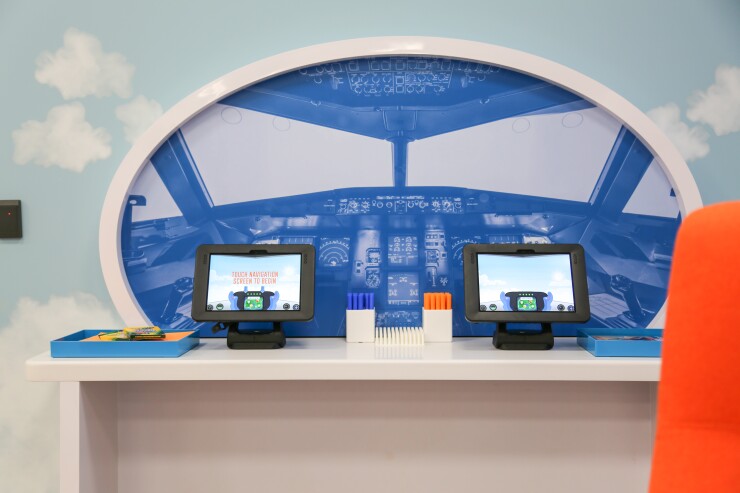
Two tablets are mounted in front of a large graphic depicting a cockpit, as if they were steering controls. Behind the “cockpit” is a blue wall dotted with white clouds. The animations on the screen outline a runway, populated by animals on either side. When children touch the screen, they can navigate to a knockoff version of Candy Crush. The tablets are detachable, so kids can grab a device and follow their parents to an office, if they like.
The effort to cater to children is a reflection of the fact that their parents are doing most simple banking tasks on a website or smartphone. When they come into the branch, they are likely to have lengthy conversations.
“If you’re going in to talk about a mortgage you might be there for a 30- to 45-minute conversation,” said Meara. “If a child’s on your lap, that could be disruptive.”
The branch also features three video teller machines from Hyosung, with one in the vestibule and two in the drive-through. Unlike with traditional ATMs, customers can request exact change, make transfers and more, but Andrews is waiting to activate the video capabilities until the machines are installed at more branches.
Drive-throughs are a
Campbell Creative also revitalized Andrews’ Instagram account, trading stock photography for images of real people and replicating the color scheme and style of the branch on social media. The credit union ran a contest on Facebook and Instagram in January, where it asked its members to describe their favorite features of the new branch. Winners received Andrews-branded Apple devices.
“The new location goes right along with the new website, great low rates and fantastic staff,” wrote one participant on Instagram.
"If you’re online and have this wonderful experience, then come to the branch and it looks dated and nothing like it does on social or with [the institution's] digital experiences, not only is that a complete disconnect but it’s false advertising," said Courtney Campbell, owner and creative director at Campbell Creative, who has designed branches for two other credit unions and the Capital One Cafes.
Andrews also incorporated a number of low-tech touches to welcome members and promote the brand in subtle ways.
The logo, which is three parallel diagonal lines, surfaces in unexpected places, such as in the pattern on the carpet and three-dimensional wall art constructed from 350 model airplanes.
“In most financial institutions, you see the logo over and over, but it’s not that way with Andrews,” said Campbell. “We’ve woven their branding throughout the space, including those ‘aha’ moments that make their branch and brand memorable.”
In lieu of a ribbon-cutting ceremony, Andrews distributed “Get Cozy” gift boxes to members, packed with hot chocolate, marshmallows, an oversized mug and a blanket. The idea was to make members feel relaxed while Andrews took care of their finances.
There are also practical features, such as movable wall panels that contain sound-absorption materials on one side and a writable surface on the other.
“This is the first branch that has taken us to another level as a credit union and as a brand,” said Holloway. “We wanted to make sure that when someone walks into the branch, there is something that will leave a lasting impression.”


